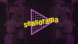
For our group, i was asked to create a logo that captured the essence of retro to incorporate the theme of the original Virtual Reality machine (senosorama) for our presentation. the presentation itself went really well and we got a really good amount of feedback to help us further our plan to showcase our work.


Presentation


No comments:
Post a Comment